

Under the direction of Professor Eric Hards, I created a Swiss-style postcard promoting an exhibition dedicated to the legendary Josef Müller-Brockmann — one of the pioneers of the International Typographic Style. This project was a deep dive into the foundations of modern graphic design, combining rigorous typographic structure with clarity, order, and simplicity.
Project Goals
The assignment was to design a front and back postcard (4.5×6 inches on each side) using only the required text, adhering to Swiss Design principles:
- Use of a strict three-column grid
- Emphasis on visual hierarchy through scale, weight, and alignment
- Minimalist use of graphics or shapes
- Helvetica or another sans-serif typeface
- Optional grayscale and one limited color accent (monochromatic, analogous, or complementary)
My Process
Sketching
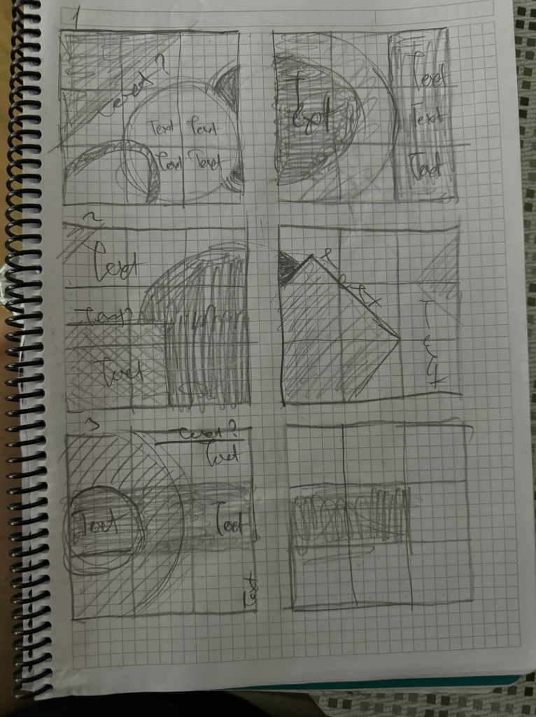
I began by quick sketching six postcard layouts using grid paper and a three-column system. These thumbnails helped me explore text alignment, contrast, and spatial rhythm before moving to digital.
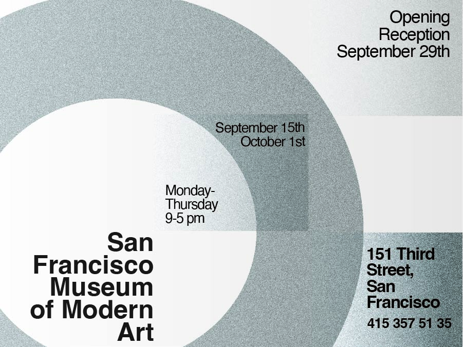
Gray – scale

At this stage, I paid close attention to:
- Aligning all elements to the visible grid
- Varying font weight and scale for typographic contrast
- Blocking secondary text into more discreet areas to maintain focus
Final Color Version
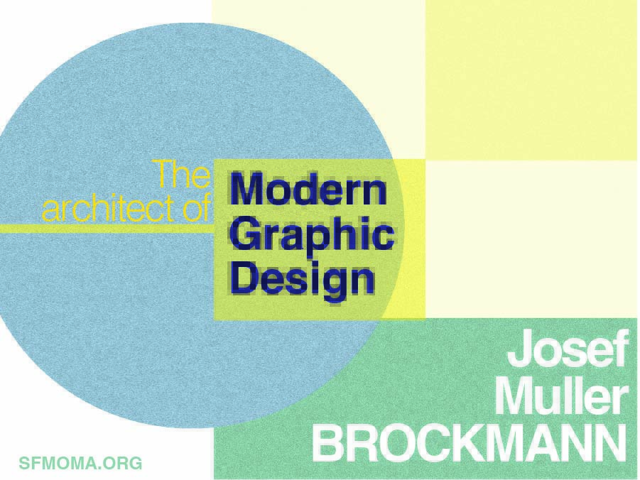
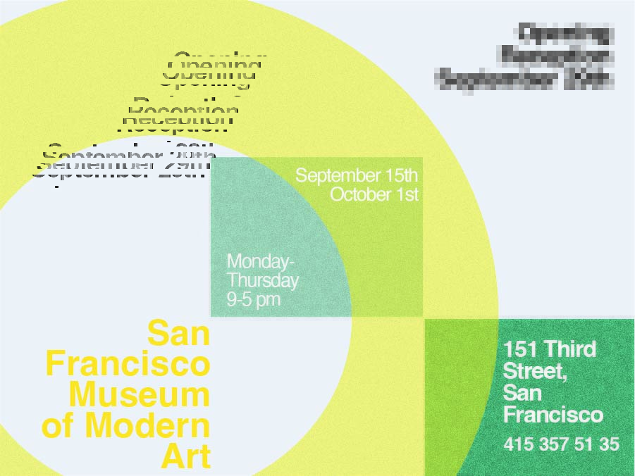
For the final design, I chose a calm, analogous palette with soft blues, greens, and yellows. The structured grid still governs the layout beneath the surface, even though the lines are now hidden.
To create contrast while maintaining order, I balanced:
- Large bold titles (e.g. “Josef Muller BROCKMANN”)
- Delicate subheadings
- Geometric shapes (circles, squares) aligned to the grid
A small pop of bright yellow draws the eye to key phrases, while other details like the date and location are set in calm, neutral tones.
Instructor Feedback
“You’ve demonstrated a clear understanding of the Swiss Style and applied it beautifully through your layout, color, and structure. This is a professional, conceptually strong postcard. Great job!”
— Professor Eric Hards, May 14, 2025
What I Learned
This project taught me how to:
- Think like a typographer, not just a visual designer
- Use a modular grid to control the layout without sacrificing creativity
- Balance text, color, and geometry with discipline
- Push clarity over decoration — the Swiss way!
